

 http://acircleandthreelines.com/about
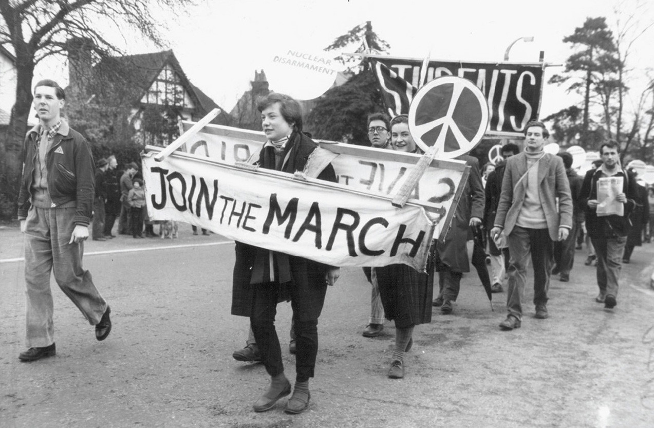
The symbol that would become synonymous with the Campaign for Nuclear Disarmament (CND) was first brought to wide public attention on the Easter weekend of 1958 during a march from London to Aldermaston in Berkshire, the site of the Atomic Weapons Research Establishment.
The demonstration—the first large-scale anti-nuclear march of its kind—was organized by the Direct Action Committee Against Nuclear War (DAC), one of several smaller groups in the U.K. that would go on to form CND. Some 500 symbols were held aloft by protesters as they walked the 52 miles from Trafalgar Square, which suggests that the organizers were aware of the need for both political and visual impact. The fact that, in the form of Gerald Holtom, they already had a professional designer and graduate of the Royal College of Art on board perhaps explains why the symbol achieved immediate success, as well as the swiftness with which it was officially adopted by CND a few months after the march. Holtom was a conscientious objector (during World War II he had worked on a Norfolk farm), and also an established designer. He had created designs as diverse as fabrics based on west African patterns from the late 1930s and a range incorporating photographs of plankton for the Festival of Britain in 1951.

According to Professor Andrew Rigby, writing in Peace News in 2002, Holtom was responsible for designing the banners and placards that were to be carried on the Aldermaston march. "He was convinced that it should have a symbol associated with it that would leave in the public mind a visual image signifying nuclear disarmament," writes Rigby, "and which would also convey the theme that it was the responsibility of each and every individual to work to remove the threat of nuclear war."
In a sense, Holtom’s design did represent an individual in pursuit of the cause, albeit in an abstract way. The symbol showed the semaphore for the letters N (both flags held down and angled out from the body) and D (one flag pointing up, the other pointing down), standing for Nuclear Disarmament. But some years later in 1973, when Holtom wrote to Hugh Brock, editor of Peace News at the time of the formation of the DAC, the designer gave a different explanation of how he had created the symbol.
It could echo both the frustrations of the anti-nuclear campaign and a sense of optimism.
"At first he toyed with the idea of using the Christian cross as the dominant motif," Rigby explains in his article, "but realized that 'in Eastern eyes the Christian Cross was synonymous with crusading tyranny culminating in Belsen and Hiroshima and the manufacture and testing of the H-bomb.' He rejected the image of the dove, as it had been appropriated by "the Stalin regime...to bless and legitimize their H-bomb manufacture.'"
Holtom in fact decided to go for a much more personal approach, as he admitted to Brock. "I was in despair. Deep despair," he wrote. "I drew myself: the representative of an individual in despair, with hands palm outstretched outwards and downwards in the manner of Goya’s peasant before the firing squad. I formalized the drawing into a line and put a circle round it. It was ridiculous at first and such a puny thing."
In Holtom’s personal notes, reproduced by peace symbol historian Ken Kolsbun, the designer recalls then turning the design into a badge. "I made a drawing of it on a small piece of paper the size of a sixpence and pinned it on to the lapel of my jacket and forgot it," he wrote. "In the evening I went to the post office. The girl behind the counter looked at me and said, 'What is that badge you are wearing?' I looked down in some surprise and saw the ND symbol pinned on my lapel. I felt rather strange and uneasy wearing a badge. 'Oh, that is the new peace symbol,' I said. 'How interesting, are there many of them?' 'No, only one, but I expect there will be quite a lot before long.'"
In fact, the first official series of badges made by Eric Austin of the Kensington CND branch were made of white clay with the symbol formed from black paint. According to CND, these were in themselves a symbolic gesture as they were distributed "with a note explaining that in the event of a nuclear war, these fired pottery badges would be among the few human artifacts to survive the nuclear inferno."

The symbol itself became more formalized as its usage became more widespread. The earliest pictures of Holtom’s design reproduce the submissive "individual in despair" more clearly: the symbol is constructed of lines that widen out as they meet the circle, where a head, feet and outstretched arms might be. But by the early 1960s the lines had thickened and straightened out and designers such as Ken Garland, who worked on CND material from 1962 to 1968, were able to use a bolder incarnation of the symbol in their work. Garland built on the graphic nature of the symbol to create a play of black-and-white shapes for a series of striking posters. He also used a photograph of his daughter Ruth in the design for a leaflet on which the symbol was used in place of the O in "SAY NO."
He rejected the image of the dove, as it had been appropriated by the Stalin regime.
In the U.K. the symbol has remained the logo of CND since the late 1950s, but internationally it has taken on a broader message signifying peace. For Holtom this perhaps came as a bonus since, according to Rigby, he had been frustrated with his original design, which depicted the struggle inherent in the pursuit of unilateral action. Shortly before the Aldermaston march Holtom experienced what he termed a "revolution of thought." He realized, Rigby writes, that if he inverted the symbol "then it could be seen as representing the tree of life, the tree on which Christ had been crucified and which, for Christians like Gerald Holtom, was a symbol of hope and resurrection. Furthermore, that inverted image of a figure with arms stretched upwards and outwards also represented the semaphore signal for U—Unilateral."
This last quirk of a symbol that had its message so neatly encapsulated in its design meant it could echo both the frustrations of the anti-nuclear campaigner in the face of political change and the sense of optimism that the task at hand would bring. This was another example of the thinking Holtom would bring to the first march to Aldermaston, which has since become an annual event. Of the lollipop signs he designed for the event, half displayed the symbol in black on white, the other half white on green. "Just as the church’s liturgical colors change over Easter," CND explain, "so the colors were to change, 'from Winter to Spring, from Death to Life.' Black and white would be displayed on Good Friday and Saturday, green and white on Easter Sunday and Monday."
From the beginning, Holtom’s aim had been to help instigate positive change, to bring about a transformation from winter to spring. Today CND continues to pursue this mission, just as the peace movement does internationally.
This was excerpted with permission from TM: The Untold Stories Behind 29 Classic Logos (Lawrence King). Buy a copy here for $27.